A great layout can still feel incomplete without the right finishing touch. Sometimes, the missing piece is surprisingly simple: a well-crafted border design.
Whether you are designing a website, creating a wedding invitation, building a social media post, decorating a notebook page, or formatting a business presentation, borders quietly shape the entire visual experience. They guide the eye, frame content, and create balance. In many cases, a thoughtful border can transform an average composition into something memorable.
The beauty of border design lies in its flexibility. It can look elegant, playful, minimal, vintage, luxurious, artistic, or modern depending on how you use it. More importantly, borders are no longer just decorative elements. Today, they play a major role in branding, user experience, visual hierarchy, typography styling, and digital aesthetics.
If your layouts often feel flat or unfinished, these border ideas can instantly improve them without requiring a complete redesign.
Why Border Design Matters in Modern Layouts
Before diving into the ideas, it helps to understand why borders remain important in graphic design and visual communication.
A border does more than separate content. It creates structure. It gives breathing space. It highlights focal points. Moreover, it helps viewers process information faster because the eye naturally responds to framed elements.
In digital and print design alike, border styles influence:
- Readability
- Page balance
- Content emphasis
- Visual contrast
- User engagement
- Creative presentation
- Brand consistency
- Layout aesthetics
A polished border design can also make inexpensive projects appear more premium. That is why professional designers often spend extra time refining edges, frames, outlines, and decorative accents.
1. Minimal Thin-Line Borders
Minimalism continues to dominate modern design trends, and thin-line borders remain one of the easiest ways to create a sophisticated layout.
These borders work beautifully for:
- Portfolio websites
- Resume templates
- Luxury branding
- Editorial design
- Business cards
- Instagram templates
The secret is restraint. A subtle one-pixel line around content creates separation without overwhelming the design.
Why It Works
Thin borders provide structure while maintaining clean whitespace. They are especially effective when paired with neutral color palettes, serif typography, and modern grid layouts.
Best Style Tips
- Use soft gray instead of pure black
- Add generous padding inside the frame
- Pair with elegant typography
- Keep corners sharp for a contemporary feel
Minimal border design often looks effortless, but achieving that simplicity requires careful balance.
2. Hand-Drawn Sketch Borders
Not every layout should feel polished and corporate. Sometimes, a rough hand-drawn border adds personality that perfectly polished graphics cannot replicate.
These sketch-style borders are popular in:
- Scrapbook design
- Classroom worksheets
- Personal journals
- Creative blogs
- DIY invitations
- Café menus
The imperfect strokes create warmth and authenticity.
Design Insight
Handmade-looking frames make digital layouts feel human. In an era filled with automated visuals, that natural touch stands out immediately.
Popular Variations
- Doodle edges
- Pencil sketch outlines
- Brushstroke frames
- Chalk-style borders
- Ink pen decorations
This type of border design works particularly well for brands that want a casual, approachable identity.
3. Floral Border Design for Elegant Layouts
Floral frames never truly go out of style. They simply evolve with design trends.
Modern floral border design can range from soft watercolor flowers to bold botanical illustrations. They instantly add charm, romance, and decorative richness.
Perfect For
| Layout Type | Why Floral Borders Work |
|---|---|
| Wedding invitations | Adds elegance and softness |
| Greeting cards | Creates emotional warmth |
| Certificate design | Gives a premium decorative feel |
| Social media graphics | Enhances visual engagement |
| Stationery templates | Adds artistic detail |
Current Trends in Floral Borders
Today’s floral layouts often include:
- Muted botanical tones
- Vintage flower illustrations
- Wildflower arrangements
- Minimal leaf patterns
- Gold-accented floral corners
A floral border design becomes even more attractive when combined with textured backgrounds and handwritten fonts.
4. Geometric Borders for Modern Structure
Geometric shapes bring order and precision into layouts. These borders feel contemporary, stylish, and visually balanced.
You will often see geometric framing in:
- Tech branding
- Presentation slides
- UI design
- Architecture portfolios
- Fashion lookbooks
Common Geometric Border Elements
- Hexagons
- Triangles
- Abstract grids
- Angular corners
- Layered rectangles
- Symmetrical patterns
One reason geometric border design performs so well is because it creates a strong visual hierarchy. It naturally directs attention toward important content.
Pro Tip
Use asymmetrical geometric borders for a more modern and dynamic appearance. Perfect symmetry can sometimes feel too rigid.
5. Double-Line Borders for Classic Sophistication
Double-line frames are timeless. They communicate professionalism, tradition, and elegance without feeling outdated.
This border style works particularly well in print layouts.
Ideal Uses
- Certificates
- Restaurant menus
- Formal invitations
- Magazine covers
- Academic documents
- Luxury packaging
Double-line border design adds depth while keeping the layout clean and organized.
Styling Suggestions
- Add spacing between lines for breathing room
- Use metallic colors for luxury appeal
- Pair with serif fonts for classic aesthetics
- Combine with embossed effects in print materials
Sometimes, subtle details create the strongest visual impact.
6. Watercolor Borders for Artistic Layouts
Watercolor borders introduce softness and fluidity into a design. Unlike sharp frames, watercolor effects feel organic and emotional.
They are especially effective for creative projects that need warmth and personality.
Where Watercolor Borders Shine
- Baby shower invitations
- Art portfolios
- Lifestyle blogs
- Pinterest graphics
- Printable planners
- Seasonal promotions
The beauty of watercolor border design lies in its unpredictability. Slight color variations and texture irregularities create a handcrafted appearance.
Trending Color Palettes
Popular watercolor combinations include:
- Sage green and beige
- Dusty blue and blush pink
- Lavender and cream
- Terracotta and peach
- Soft monochrome washes
This style also blends beautifully with modern calligraphy and textured paper effects.
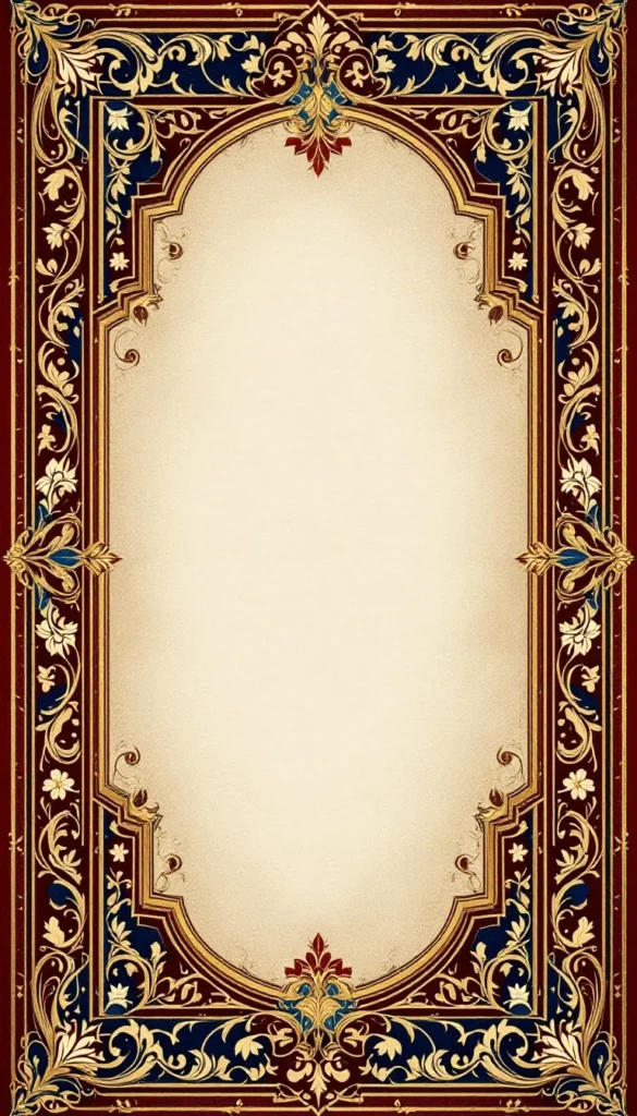
7. Vintage Ornamental Borders
Vintage-inspired frames instantly create nostalgia and sophistication. These decorative borders often feature intricate curves, ornamental flourishes, and antique detailing.
Common Vintage Influences
- Victorian patterns
- Art Deco styling
- Retro typography
- Baroque flourishes
- Antique engraving aesthetics
Vintage border design remains extremely popular for premium branding and editorial storytelling.
Best Applications
- Book covers
- Whiskey labels
- Boutique branding
- Luxury certificates
- Historical presentations
- Event posters
However, balance is important. Too many decorative elements can overwhelm the layout. The best vintage borders complement the content rather than competing with it.
8. Bold Color Block Borders
If your layout lacks energy, bold color borders can completely change its personality.
This style embraces contrast, vibrant tones, and strong visual framing.
Why Designers Love This Trend
Color block borders create instant attention. They also improve content separation, especially in digital media where viewers scroll quickly.
Great For
- YouTube thumbnails
- Marketing banners
- E-commerce graphics
- Social media ads
- Fashion campaigns
- Youth-oriented branding
Effective Color Combinations
- Black and neon yellow
- White and cobalt blue
- Coral and navy
- Purple and orange
- Emerald green and cream
A vibrant border design can dramatically improve click-through rates because it naturally attracts visual attention.
9. Decorative Corner Borders
Sometimes less is more. Instead of framing the entire layout, corner borders decorate only selected areas.
This subtle technique keeps layouts open and breathable while still adding elegance.
Common Corner Border Styles
- Floral corners
- Gold ornamental accents
- Geometric corner lines
- Minimal brackets
- Vintage curls
Corner-based border design is especially effective in minimalist layouts because it preserves whitespace while enhancing composition.
Best Use Cases
- Quote cards
- Invitation templates
- Certificates
- Website hero sections
- Presentation covers
This approach works beautifully when the central content deserves maximum focus.
10. Layered Mixed-Media Borders
One of the biggest modern design trends involves combining multiple textures and border styles together.
Mixed-media borders may include:
- Torn paper effects
- Paint strokes
- Tape graphics
- Polaroid frames
- Fabric textures
- Digital overlays
These layered compositions feel highly creative and visually rich.
Why This Style Feels Fresh
Modern audiences respond strongly to texture and depth. Flat layouts sometimes feel generic, whereas layered border design creates dimension and storytelling.
Creative Example
Imagine a travel scrapbook layout featuring:
- A torn notebook edge
- Washi tape accents
- A thin white frame
- Handwritten notes
- Vintage stamp textures
The result feels immersive and personal rather than sterile.
How to Choose the Right Border Design
Not every border fits every project. Choosing the wrong frame can weaken an otherwise strong layout.
Here are a few factors worth considering.
Match the Mood
Ask yourself:
- Is the design formal or casual?
- Modern or vintage?
- Minimal or decorative?
- Professional or artistic?
Your border should reinforce the overall tone.
Prioritize Readability
A border should enhance content, not distract from it.
Avoid:
- Overly busy patterns
- Thick frames around small text
- Excessive decorative details
- Clashing color combinations
Good border design improves clarity rather than reducing it.
Consider Platform Differences
Borders behave differently across mediums.
Print Design
Print layouts can support more detail and texture.
Digital Design
Digital interfaces usually require cleaner edges and responsive spacing.
Mobile Layouts
Thin borders and minimal frames often work best on smaller screens.
Use Color Strategically
Border colors influence emotional perception.
| Color | Common Feeling |
|---|---|
| Gold | Luxury |
| Blue | Trust |
| Green | Calmness |
| Black | Sophistication |
| Red | Energy |
| Beige | Warmth |
Choosing the right border color can dramatically affect user response.
Common Border Design Mistakes to Avoid
Even experienced designers sometimes overdo borders.
Here are the biggest mistakes.
Overcrowding the Layout
Too many decorative elements make designs feel chaotic. Borders should support composition, not dominate it.
Ignoring Spacing
A beautiful frame becomes ineffective when content sits too close to the edges.
Always leave enough padding.
Using Low-Quality Graphics
Pixelated border assets instantly reduce professionalism. High-resolution design elements matter more than many people realize.
Following Trends Blindly
Trendy border styles can look outdated quickly. Instead of copying viral designs, adapt trends to fit your own aesthetic.
Quick Border Design Checklist
Before finalizing your layout, review this checklist:
- Does the border match the theme?
- Is the spacing balanced?
- Does the frame improve readability?
- Is the color palette cohesive?
- Does the design feel modern?
- Is the border scalable for different screen sizes?
- Does it support the focal point?
- Is the composition visually balanced?
Small refinements often create the biggest improvements.
Final Thoughts
A strong border design does far more than decorate a page. It shapes perception, guides attention, and gives layouts a polished identity. Whether you prefer minimal lines, floral frames, geometric patterns, or layered mixed-media styles, the right border can instantly elevate ordinary content into something visually compelling.
The best part is that you do not need advanced design skills to use borders effectively. Often, a simple framing adjustment completely changes the mood and professionalism of a layout.