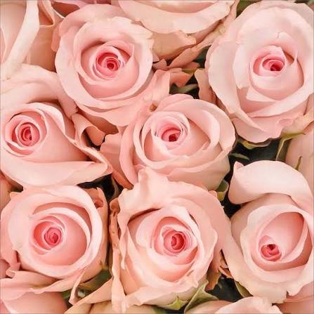

Have you ever picked a light pink color that looked beautiful online but completely different in real life? You’re definitely not alone. A shade that appears soft and elegant on one screen can suddenly feel too peachy, too cool, or even washed out once it’s on a wall, a dress, or a piece of furniture.
That’s the fascinating thing about color. Even a subtle difference in tone can change the entire mood of a room, outfit, or creative project.
The good news is that choosing the perfect light pink shade isn’t about luck. It’s about understanding undertones, lighting, materials, and how colors work together. Once you know these basics, selecting the right pink becomes much easier—and much more enjoyable.
Whether you’re decorating a bedroom, choosing wedding colors, buying clothing, designing a logo, or refreshing your home’s interior, this guide will help you confidently find the ideal light pink for your needs.
Why Light Pink Never Goes Out of Style
Color trends come and go, but light pink continues to remain one of the most versatile shades available.
Unlike bold pinks that demand attention, lighter tones create a calming, welcoming atmosphere. They feel elegant without being overwhelming and work beautifully in modern, classic, minimalist, vintage, and Scandinavian designs.
Some of the biggest reasons people love light pink include:
- Creates a soft and relaxing atmosphere
- Adds warmth without overpowering a space
- Complements both cool and warm color palettes
- Suitable for every age and gender
- Works well in fashion, interiors, branding, and events
- Easily pairs with neutral colors
Its flexibility is exactly why designers, homeowners, and stylists continue choosing it year after year.
Understanding Different Types of Light Pink
Not every light pink looks the same.
In fact, there are dozens of beautiful variations, each creating a different feeling.
Warm Light Pink
Warm shades contain subtle peach, coral, or beige undertones.
These shades feel:
- Cozy
- Friendly
- Inviting
- Comfortable
They’re excellent for living rooms, nurseries, and casual fashion.
Examples include:
- Blush
- Peach pink
- Rose beige
- Soft coral pink
Cool Light Pink
Cool pinks lean toward lavender or blue undertones.
They often create a look that’s:
- Elegant
- Fresh
- Modern
- Sophisticated
Popular cool pink shades include:
- Ballet pink
- Powder pink
- Cotton candy pink
- Ice pink
These work particularly well in contemporary interiors and formal clothing.
Neutral Light Pink
Neutral shades balance both warm and cool undertones.
They’re among the easiest colors to decorate with because they blend naturally with many palettes.
Common examples include:
- Dusty pink
- Nude pink
- Soft blush
- Pale rose
How Lighting Changes Light Pink
One of the biggest mistakes people make is choosing paint or fabric without considering lighting.
The exact same light pink may appear completely different depending on the environment.
Natural Sunlight
Morning sunlight often enhances cool tones.
Afternoon sunlight usually makes pinks appear warmer.
Rooms facing north tend to produce cooler-looking colors, while south-facing spaces create warmer, brighter pinks.
Artificial Lighting
Different bulbs also influence appearance.
| Light Type | Effect on Light Pink |
|---|---|
| Warm White | Makes pink richer and warmer |
| Cool White | Adds crispness and cooler tones |
| LED Daylight | Shows the truest color |
| Soft White | Creates a cozy appearance |
Always test paint samples under the lighting you’ll actually use.
Consider the Purpose Before Choosing a Shade
Every project requires a different type of pink.
For Interior Design
A soft blush creates peaceful bedrooms.
A muted dusty pink works beautifully in living rooms.
Powder pink brightens bathrooms.
Warm rose shades make dining spaces feel inviting.
For Fashion
When selecting clothing, think about your skin tone.
People with warm undertones often look best in:
- Peach pink
- Salmon pink
- Warm blush
- Soft coral
Those with cool undertones usually shine in:
- Ballet pink
- Baby pink
- Powder pink
- Rose quartz
Neutral undertones can wear nearly every variation comfortably.
For Weddings
Light pink remains one of the most popular wedding colors because it feels timeless.
Beautiful pairings include:
- Light pink and ivory
- Light pink and champagne
- Light pink and sage green
- Light pink and gold
- Light pink and dusty blue
These combinations create romantic, elegant celebrations.
For Branding
Businesses often choose light pink because it communicates:
- Kindness
- Luxury
- Calmness
- Creativity
- Elegance
- Warmth
Beauty, skincare, wellness, bakery, and fashion brands frequently use it to build a welcoming identity.
Matching Light Pink with Other Colors
Color combinations can dramatically change the final look.
Here are some of the best pairings.
White
Creates a fresh, airy appearance.
Perfect for minimalist interiors and modern branding.
Gray
Adds sophistication.
Light gray balances pink beautifully without stealing attention.
Beige
Produces warmth and softness.
Excellent for cozy living spaces.
Navy Blue
Creates striking contrast while remaining elegant.
Ideal for fashion and professional designs.
Sage Green
One of today’s most popular combinations.
The natural green tones soften the sweetness of pink.
Charcoal
Perfect for modern interiors.
Dark accents make light pink appear even softer.
Gold
Adds luxury.
Gold accessories paired with pale pink instantly elevate a room or event.
Black
Provides bold contrast while maintaining elegance when used sparingly.
Popular Light Pink Shades You Should Know
Although all belong to the same family, each shade has its own personality.
Blush Pink
Soft and romantic.
Works almost everywhere.
Baby Pink
Fresh, youthful, and cheerful.
Great for children’s rooms and spring fashion.
Powder Pink
Clean and sophisticated.
Popular in luxury interiors.
Dusty Pink
Muted and mature.
Excellent for modern homes.
Rose Pink
Classic and elegant.
Suitable for weddings and formal wear.
Ballet Pink
Graceful and feminine.
Common in fashion collections.
Nude Pink
Neutral and timeless.
Pairs effortlessly with earthy colors.
Pastel Pink
Bright but gentle.
Ideal for seasonal décor and creative projects.
How to Test a Light Pink Before Committing
Never rely only on digital images.
Instead:
- Buy sample paint cards.
- Test multiple shades together.
- View samples in morning and evening light.
- Compare them beside flooring.
- Check them against furniture.
- Observe them on cloudy and sunny days.
These small steps prevent expensive mistakes.
Common Mistakes People Make
Even experienced decorators sometimes choose the wrong shade.
Avoid these common errors.
Ignoring Undertones
Two pinks may appear identical until placed together.
Always compare multiple options.
Choosing Based on Photos Alone
Phone and computer screens display colors differently.
Physical samples remain the safest choice.
Forgetting Existing Décor
Consider flooring, curtains, furniture, countertops, artwork, and cabinetry before selecting a pink.
Everything should feel connected.
Going Too Bright
Many people accidentally select a pink that’s more vibrant than expected.
Testing samples helps avoid this issue.
Best Materials That Pair with Light Pink
Texture matters just as much as color.
Beautiful combinations include:
- Natural wood
- Linen
- Cotton
- Marble
- Velvet
- Brass
- Glass
- Ceramic
- Matte finishes
- White oak
Together, these materials create warmth and balance.
Light Pink in Different Rooms
Bedroom
A calming blush creates a peaceful retreat.
Pair it with cream bedding and natural wood furniture.
Living Room
Dusty pink walls combined with gray sofas offer timeless sophistication.
Kitchen
Use pink through backsplashes, accessories, or painted cabinets for subtle charm.
Bathroom
Powder pink towels and decorative accents create a spa-like atmosphere.
Nursery
Soft pink remains a classic choice because it feels comforting and gentle without overwhelming the room.
Seasonal Inspiration
Different seasons complement different pink tones.
| Season | Best Light Pink Shades |
|---|---|
| Spring | Pastel pink, blush |
| Summer | Coral pink, peach pink |
| Autumn | Dusty rose, muted blush |
| Winter | Powder pink, icy pink |
How Light Pink Affects Mood
Color psychology suggests that soft pinks encourage relaxation and emotional comfort.
Many people associate light pink with:
- Peace
- Compassion
- Romance
- Gentleness
- Optimism
- Freshness
- Innocence
- Warmth
- Balance
- Comfort
Although personal preferences always matter, these emotional associations explain why pink remains popular in homes, hospitality spaces, and wellness environments.
Final Thoughts
Choosing the perfect light pink shade is about much more than picking a pretty color. The right shade should complement your lighting, match your surroundings, reflect your personal style, and create the atmosphere you want. From soft blush and powder pink to dusty rose and warm peach tones, every variation offers something unique.